Automating Design Quality Control with Figma, Cursor, and MCP
Design System Sandbox: AI-Powered Quality Assurance
Bridging the gap between static design and production reality. How I use AI agents to validate architecture, accessibility, and component logic before handoff.
In enterprise environments, the cost of fixing a design error in production is 10x higher than fixing it in the design phase. Static Figma mockups, while beautiful, cannot simulate the complexity of a live browser environment.
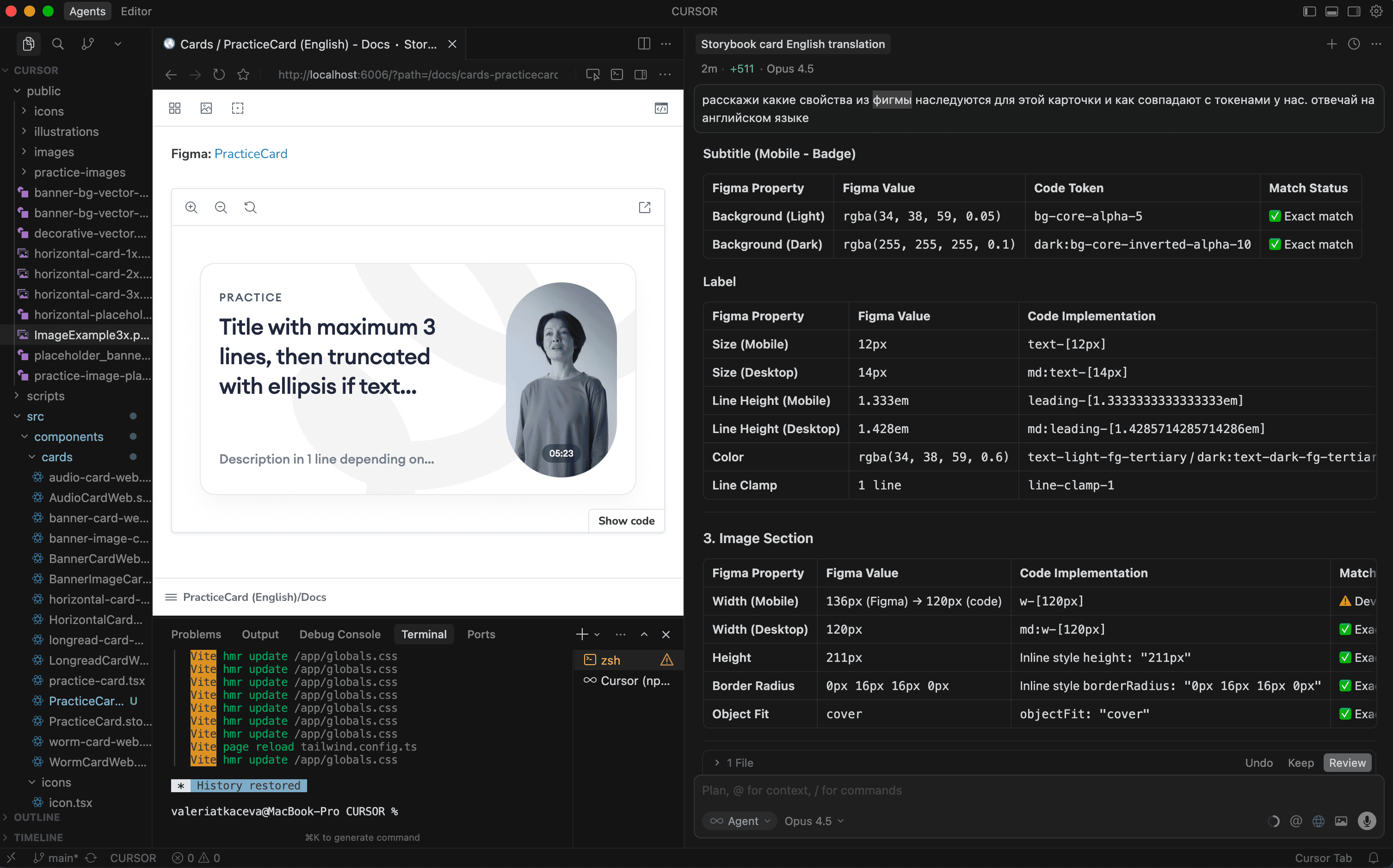
To solve this, I established a "Design QA Lab"—an internal sandbox where I use AI tools (Cursor + Model Context Protocol) to instantly convert Figma definitions into working React components. This allows me to test tokens, themes, and accessibility in a real DOM environment, ensuring that what I hand off to engineering is robust and technically feasible.
The Challenge: "The Static Trap"
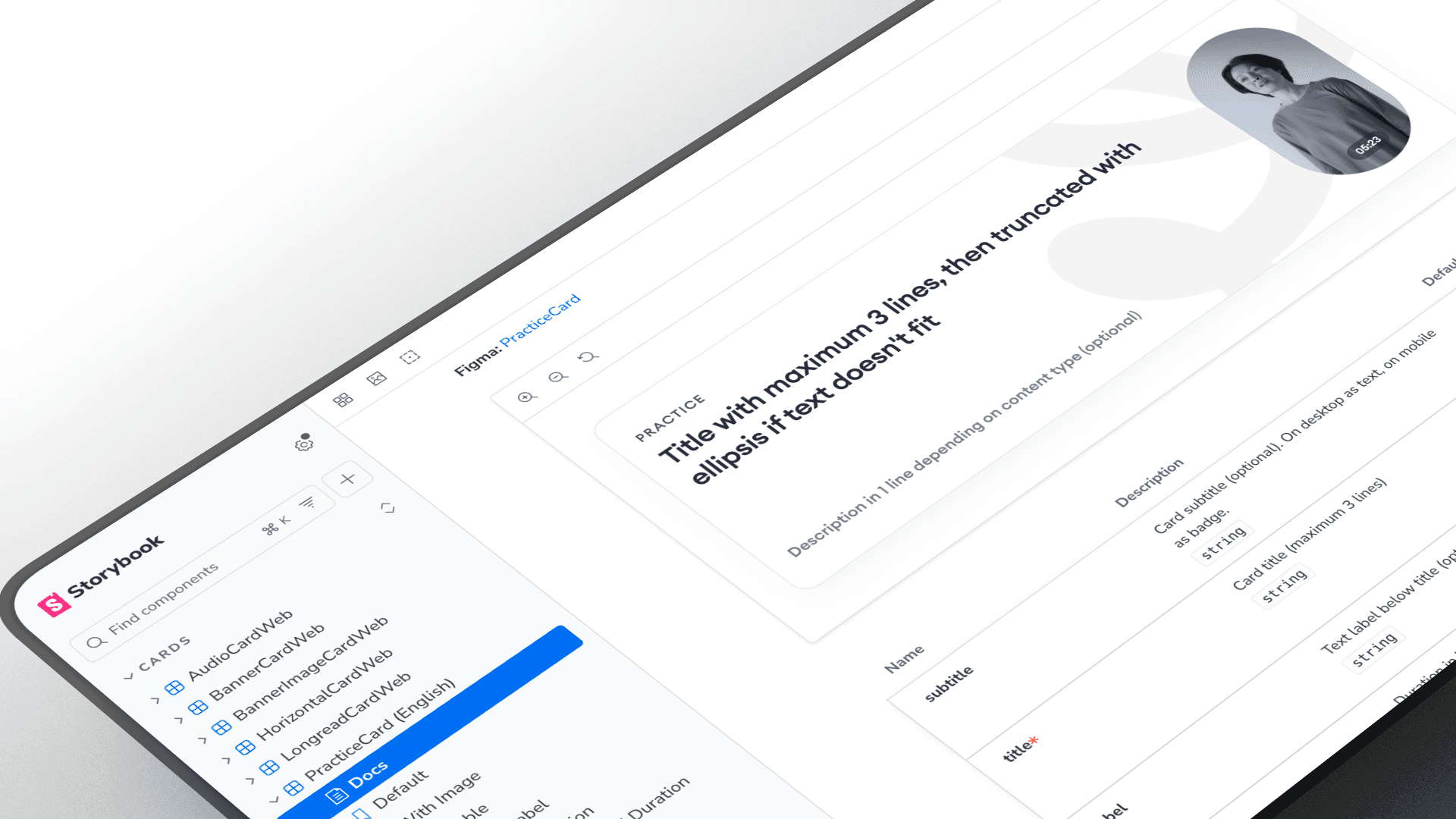
Design systems often fail during the handoff because of "The Static Trap"—assumptions made in vector tools that break in code.
Theme Logic: Does the
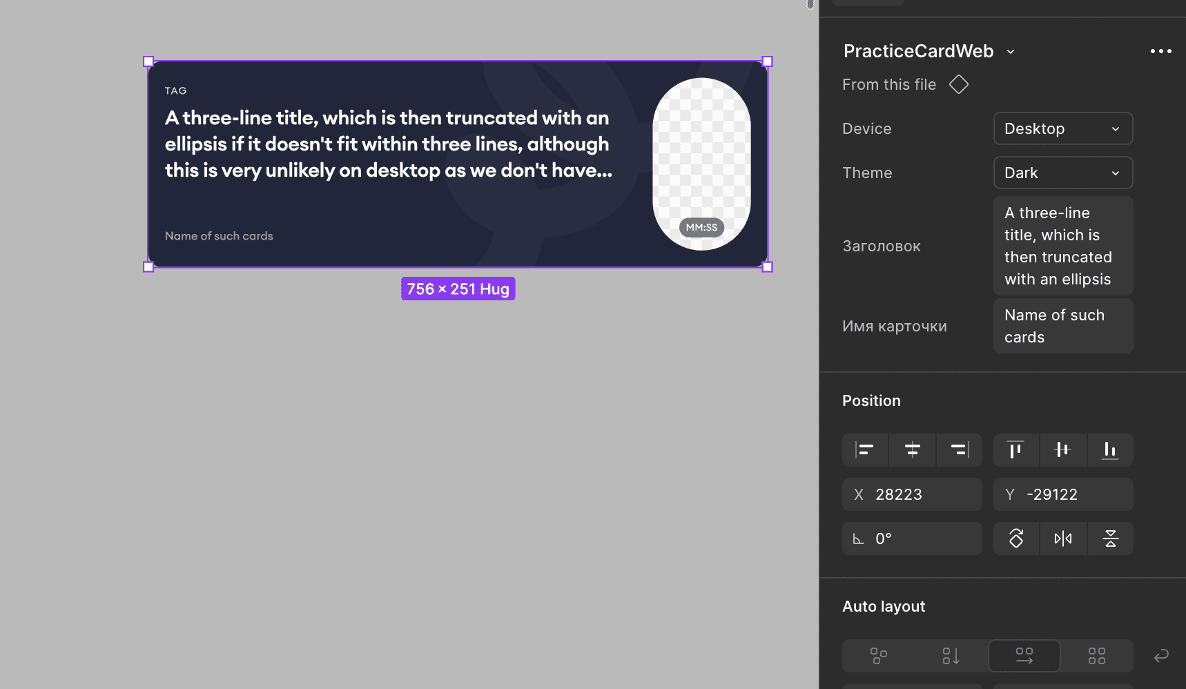
Surface/Secondarytoken actually work in Dark Mode?Content Stress: What happens when a title is 3 lines long instead of 1?
Accessibility: Is the contrast ratio compliant when the component is in a
Disabledstate?
I needed a way to verify these "engineering truths" without distracting the core development team.
The Solution: AI-Driven Workflow
I implemented a modern "Design Ops" workflow that treats design tokens as the source of truth and code as a validation tool.
The Stack:
Figma: Source of truth (Variables & Properties).
Cursor (AI Editor): The orchestration engine.
MCP (Model Context Protocol): Connecting the AI to the local codebase context.
Storybook: The visualization and testing environment.
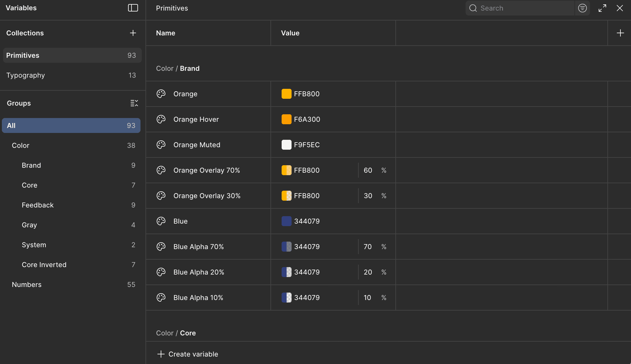
Foundation: Semantic Token Architecture
A scalable system starts with robust logic. I organized the system using Figma Variables with a strict two-tier hierarchy:
Primitives: Raw values (e.g.,
Blue/500,Space/16px).Semantics: Context-aware aliases (e.g.,
Action/Primary/Background,Spacing/Layout/M).
This structure allows for seamless multi-brand support and instant Dark Mode switching, which I validate directly in the browser.
Component Logic & "Dev Mode" Alignment
To ensure my components are "code-ready," I align Figma component properties directly with React props.
Slots: For flexible content injection.
Boolean Properties: For toggling elements (
hasIcon,isLoading).Instance Swaps: For icon management.
When a developer inspects my file in Dev Mode, the structure mirrors the component API they will build, reducing cognitive load and interpretation errors.
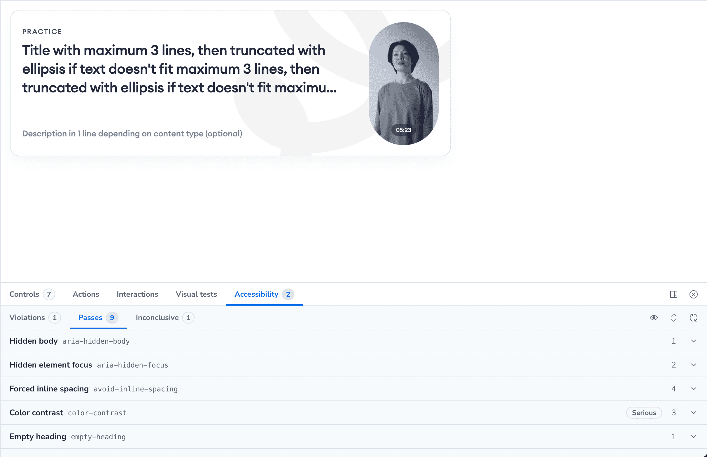
The Sandbox: Validation & Accessibility Testing
This is the core value of the initiative. Instead of guessing, I prove the design works. Using the AI-generated sandbox, I run automated and manual tests:
Accessibility (a11y): The Storybook
a11yaddon automatically flags contrast violations and missing ARIA labels.Responsiveness: Testing component behavior in fluid containers to ensure Auto Layout translates correctly to Flexbox/Grid.
Stress Testing: Injecting extreme data (e.g., names with 50 characters) to ensure the UI handles edge cases gracefully without breaking.
From "Pixel Perfect" to "Logic Perfect." By integrating code-based validation into the design process, I shifted the focus from purely visual delivery to architectural robustness. This approach minimizes technical debt, accelerates development cycles, and ensures that the final product scales reliably across the enterprise ecosystem.
Tools Used: Figma, Cursor AI, React, Tailwind CSS, Storybook.